Manifesto

Have fun
Aim for the impossible
Make a positive change, even if it’s minor
Ignore praise and praise (constructive) criticism.
Solve Problems using art as the vehicle, the medium does not limit me
Happiness is key, good mind equals production.
Get the job done and have fun doing so
Listen, reflect, and react
Work hard

Ryan_SwaggafestoRyan Ruhi

Stand up, Speak up.

My entry for a competition being run, for the cover of a new anti-bullying magazine called “Stand Up, Speak Up”.

This was a one week self directed brief to create a piece that will tackle bullying, and hopefully get my work and message out there.

The piece is based around the notion that bullies are often bullies because they are being hurt themselves, and they think by hurting others it will somehow fix or heal their own pain. Im hoping by addressing the psychology behind bullying, i can achieve a more successful competition piece.

Blog Revamp + Evaluation

Screen Shot 2014-08-14 at 10.50.51 PM Screen Shot 2014-08-15 at 12.56.08 AM


(website)                                                           (Blog)

I’ve simplified my blog and matched the feel of my website to try and install some brand consistency. Using a white template, adding the logo I developed for myself and giving the blog and website similar aesthetics. Doing so will hopefully give the feeling of professionalism but mostly its for me and its what I enjoy.

Evaluation: This brief has taught me a lot about professionalism and what I need to do to “make it”. I believe I have put a lot of work in and am proud of everything I’ve done in such a small amount of time. Managing to be able to research artist websites, build a site, document the process in bookwork and blog, as well as go to a Arts festival in Hamilton. Huge turn around from last semester and its good to be back…

Website : SquareSpace

whiteback

I’ve created my site and I am happy with it as of now. Still a lot of work to do but i have the basic navigation of my site sorted. I have a lot of work to do when it comes to HTML coding and making the homepage function the way I planned in my website development, but I have the basic clean and sleek site that I wanted.

I tried achieving this look on WordPress but it  just was too hard to get it how i wanted. I think in the long run it will be a good idea to use WordPress because of how much it updates and the endless possibilities, but for now I’m happy with what I have on SquareSpace.

If you wish to take a look around, click on this link: www.RyanRuhi.com as well as enter this visitors password : EIT777

illustration done especially for the website.

Logo Design

IMG_5391       IMG_5390       IMG_5388

After a bit of playing with logo designs, I felt that that none of them really captured me as a person or artist. I decided to revisit my signature, in particular my initials. After a lot of adjustments and spin offs, I landed on this..

1407461833059

It’s really hard to create a logo you will use for the rest of your life, but I am happy that this portrays me as of now.

I chose to use my signature as a starting point because to me a signature is like your personal stamp on things, and assures authenticity. It also could mean that I’m prepared to do business, and if you are looking for me to do work for you, lets sign on the dotted line and get to work.


My Website Development

Taking into account all my research and critiquing of other artist websites, I had a rough idea on what i wanted. I started with really rough sketches of different concepts as well as layouts and navigation of the site. After a lot of drawings and planning, I took the initiative to create my desired site on Adobe Illustrator and Photoshop. I wanted to clearly communicate what it was I really wanted, so that if I did not reach my goals I could refer to my mock-ups to show what I was aiming for.

Homepage:

My goal for my homepage is to have a fun, interactive sense to hopefully keep my viewers attention. I found in my research that I enjoy more image based sites with minimalistic layouts and the least amount of text possible.

I wanted to create my homepage that when the the viewer first clicks on my page it just has an illustration of my face like so..

site mock up1 copy

but when the viewer places the mouse over (not click) the heading “works” , the image is changed to a picture of my face (this example I chose to use an image i found on the internet and illustrated it in the style I wanted) again, but with the added theme of “works”

site mock up copy

so for this one i used a woman with a pencil and paintbrush in her mouth to represent my works.

I planned to have the other headings functioning to when the viewer mouses over “contact”, it will have an illustration of me with a phone up to my face ready to take your call.

This all would involve coding and I’ve been in contact with coders and also tried to learn HTML coding for myself and will achieve this eventually.

Navigation: A big focus of mine was to have an easy navigated site so that my viewer has the smoothest experience possible. Once you click on “works”, you are navigated to this screen..

Print

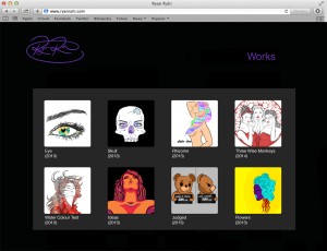
A simple gallery view of all my works (focusing on digital illustration) with a tittle and date below, if the viewer clicks on a piece they like..

Print

They get a full size version, as well as all the information about the piece.

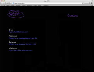
Last but not least was my “contact” page, where I really wanted to make sure that all my details were hyperlinked and clickable. I found in my research that if an artist had links that weren’t clickable, I gave up and did not pursue that link and moved on to the next thing. So it is important for me to have all my links clickable.

Screen Shot 2014-08-08 at 11.50.55 PM

I have a signature at the top left that will act as a logo, I will develop this further and substantiate my use of the signature.

I am happy with these mock-ups, for they communicate my ideas a lot clearer than my pencil drawings. I hope to produce my site to something on this level.


Ben Pearce

Screen Shot 2014-08-08 at 10.48.59 PM

Ben Pearce is a local practitioner who has been in Hawke’s Bay for 8 years working from his home. Ben creates sculptures from his home and is currently working with furniture designer, David Trubridge. Ben’s talk with us was probably one of the most honest and eye-opening lectures I’ve had and some points he brought up applied directly to me, and i think his talk benefited me greatly. Ben Pearce’s real life experiences and the things he went through to get where he is, was exactly what i needed to hear to push myself.

Ben’s honesty was refreshing, the last thing I needed was another scare tactic telling me “you can’t make it blah blah..” . Ben let us know that we can make it, but its all about putting in the hard work, networking and perseverance.  This hit home the hardest with me and I believe I can make it in some way, if I work hard and let passion drive me.

I learnt a lot from this lecture, not strictly about art but more about personal motivation, design skills and how to market yourself to employers. I was very lucky to have been at the lecture and it has given me the fuel i need to push myself to work harder.

Here is a link to Ben Pierce’s site, please check it out! http://www.benpearce.co.nz

Business of being an Artist

This Project we have been encouraged to explore our identity as an artist, in the over all goal of developing a brand as a creative practitioner. I will be creating a professional website to:

*Showcase my work in an organised and professional manner.

*Create a way for the viewer to be able to contact me.

*Give the audience a view on who I am.

Our site should be very personal and portray the artist appropriately, while still having a sense of professionalism. My starting point will be to research other artists sites to investigate and critique. I will then negotiate what I would like to apply to my own site and then go from there.

End of the year review

I think this year was about us exploring our skills and interest more in order to find what we would like to pursue in the future, but I think I am more confused than ever. My direction changes so frequently and now we are coming to the part of our studies where we have to choose our path, and I think I am leaning towards the Fine Arts. I don’t really have a definitive reason “why” just yet, but i think it doesn’t really matter because i will always be somewhere down the middle of Design and Fine Arts. I have grown as an artist this year, not only in my skill sets but with my concepts and way of thinking. This year I really challenged myself to accept ways that i previously wouldn’t think twice about, and to enter art with an open mind. The whole year has been a great experience and I cant wait to see whats in store in 2014. 

Beating Heart.

A short film displaying my mechanical heart in the manner it will be exhibited. I scattered the materials and scrap parts around the functioning heart to make it look like the heart has created itself and to also help the over all look of the piece. Last but not least i have added a loop of the sound of a beating heart which is playing in a speaker amongst the junk surroundings.

Overall I am extremely happy with the end result and it is completely different to what i normaly would have done. In this brief i completely challenged myself by doing a 3D kinetic sculpture and im happy i did because all the experimentation, and all of the discoveries i made were completely new to me and was exciting right the way through.The most challenging thing about the process was to add new things without effecting the work i had previously done.

Another challenge was to attach things that would not stop the function of the whole thing.I am happy with the result and I have completely surprised myself. It couldnt have got to where it is now without the ongoing help from my class mates with them donating parts and junk along with solid advice.